Schindler | Video Design
Visual direction, editorial design and storyboarding
Episode 2 was an opportunity to move the series beyond a conventional corporate explainer format.
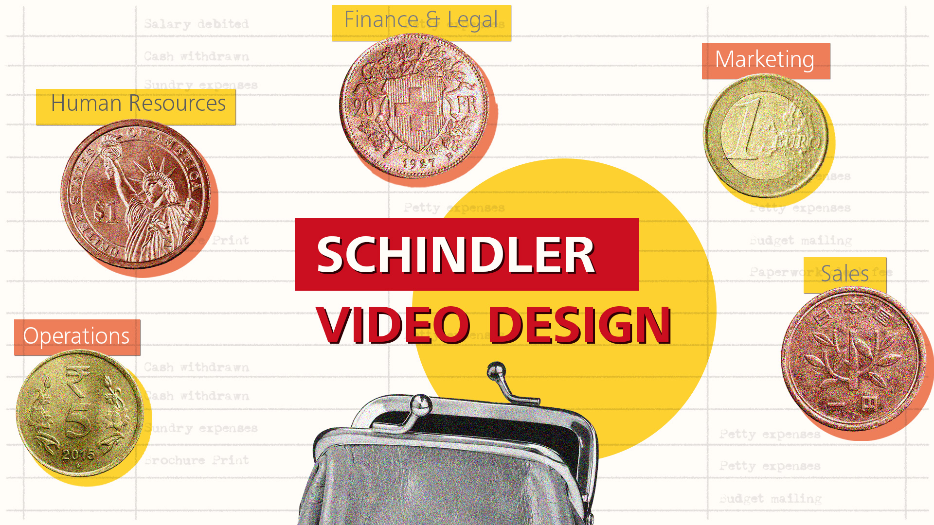
We developed an editorial visual language using cut-out photography, bold typography, texture and playful visual metaphors—designed to make dense information easier to follow and more engaging to watch.
The film contains proprietary internal communication, so the final video and subject matter cannot be shared. This case study focuses on the visual direction and design system behind it.
From corporate explainer to editorial storytelling
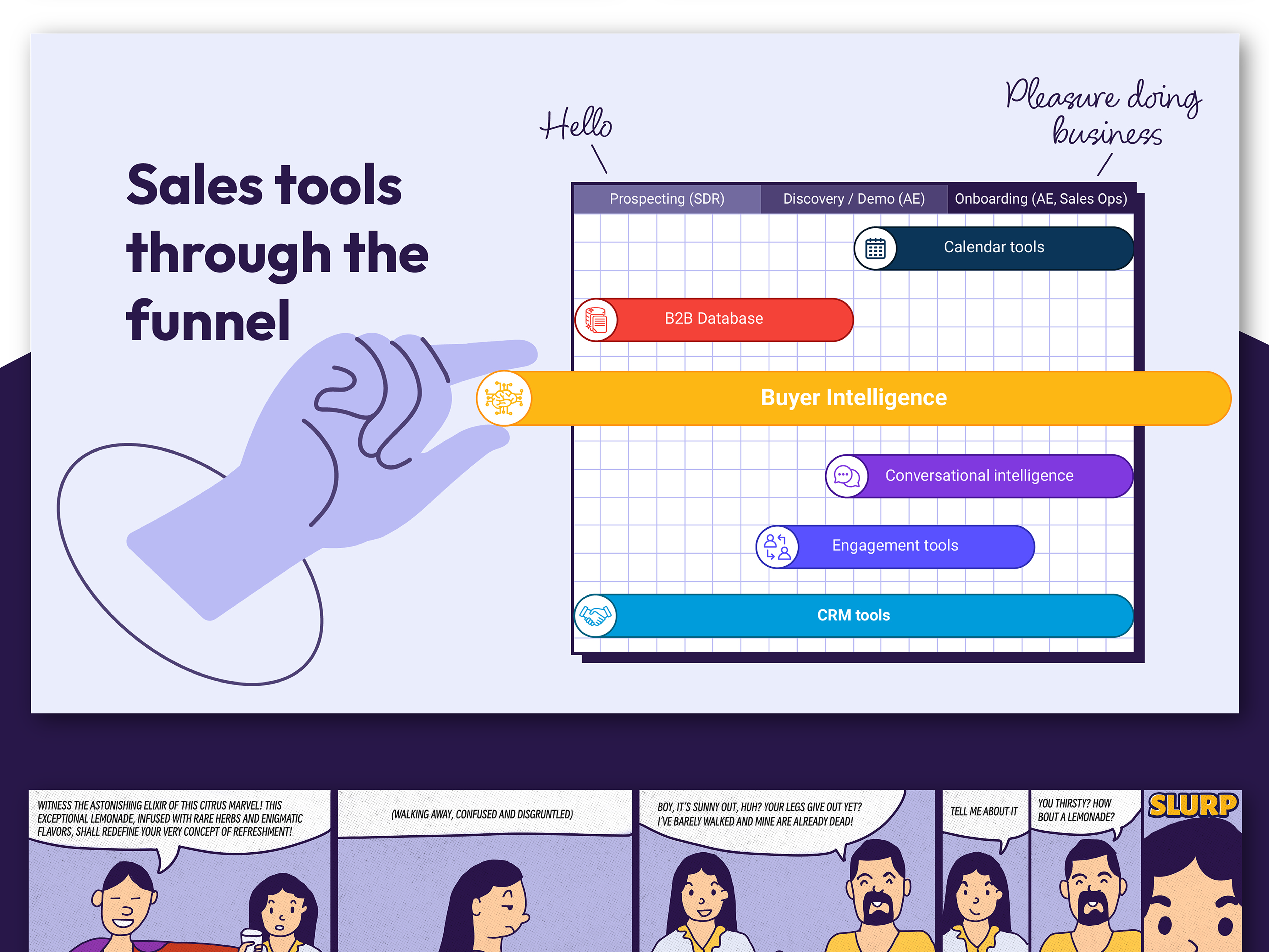
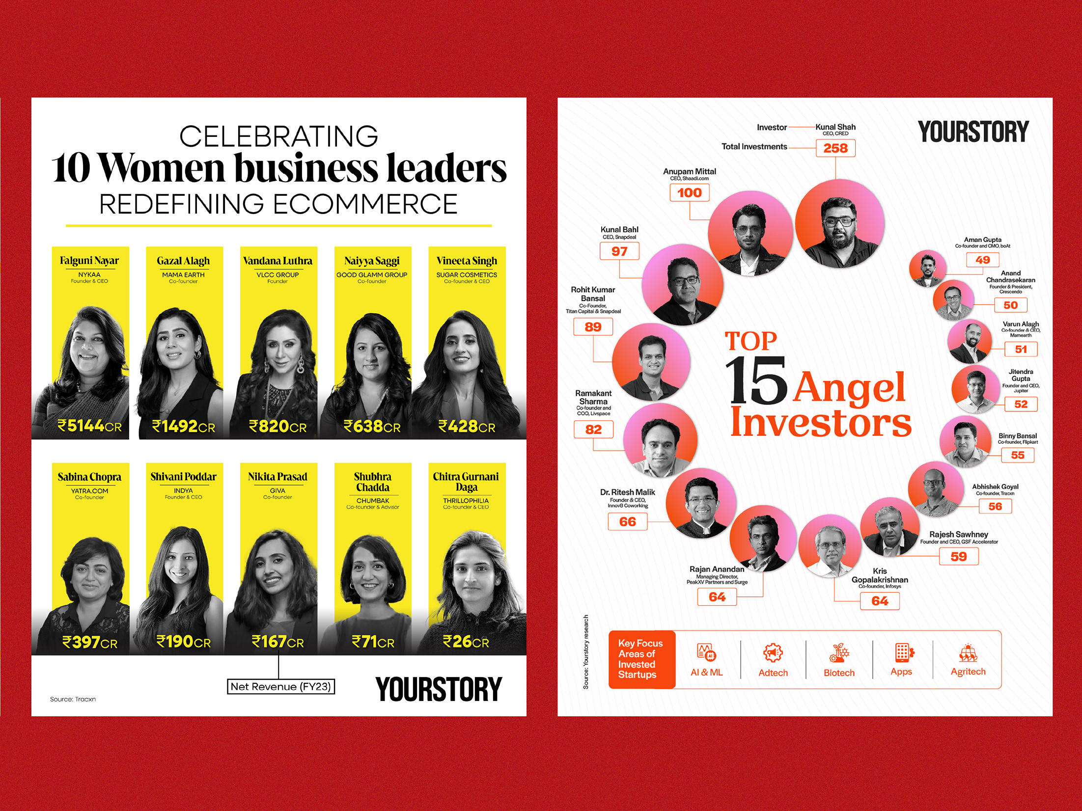
The previous episode relied on flat vector illustration, repeated card-based layouts and a largely uniform visual rhythm. For Episode 2, we introduced greater variation in scale, composition and image-making, giving each idea its own visual moment while keeping the overall experience cohesive.
The Editorial System
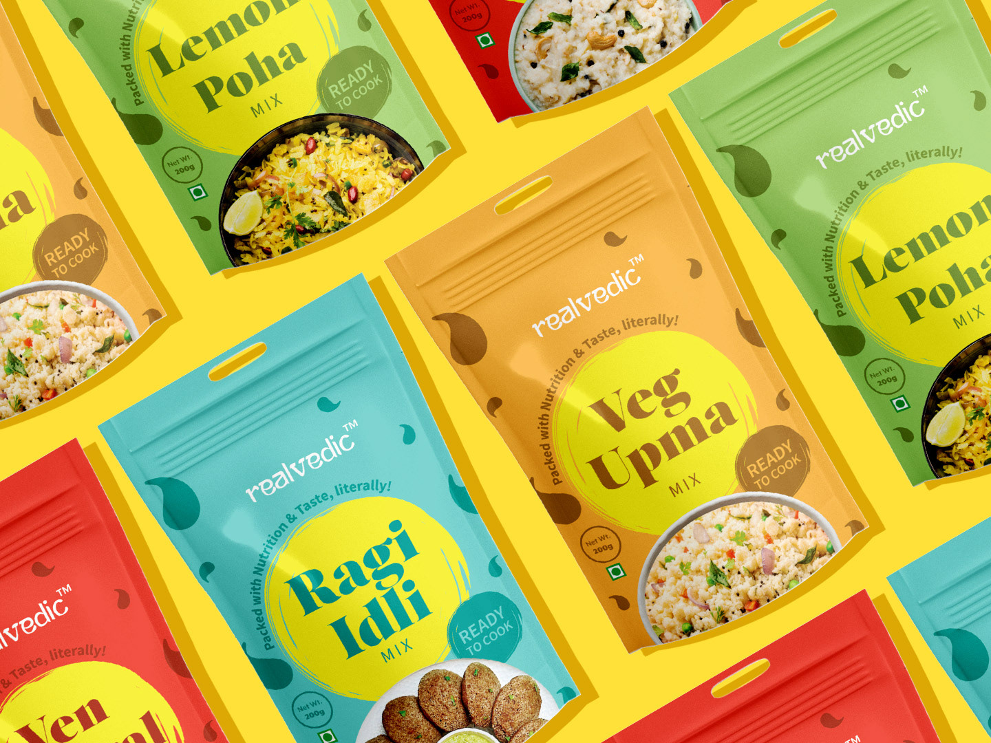
A flexible system of typography, photography, texture and collage allowed each idea to feel distinct while remaining part of one cohesive visual world.
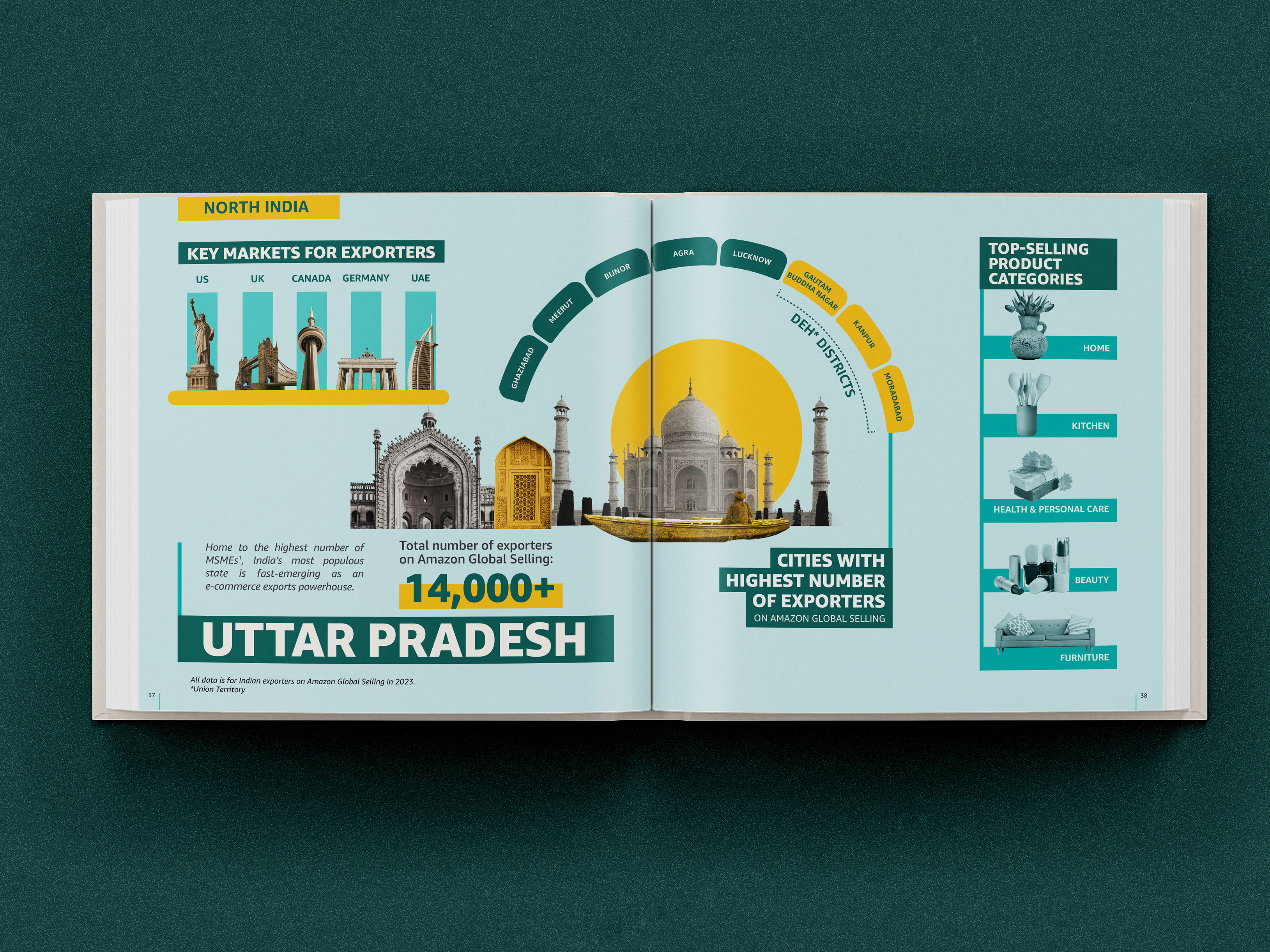
Typography and information
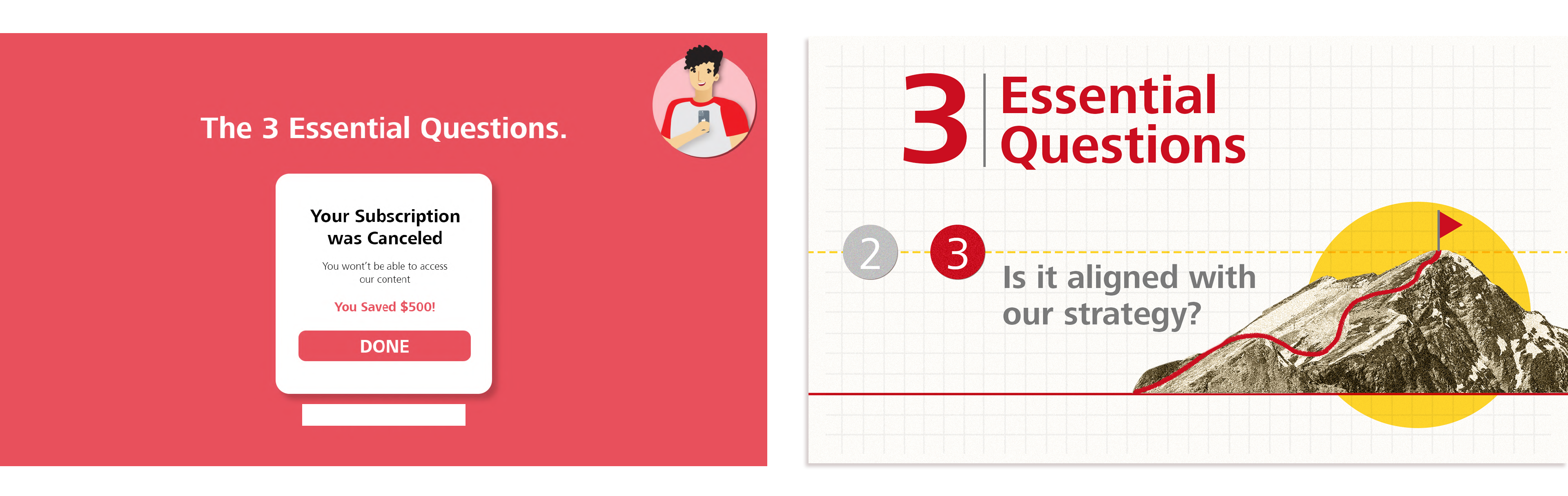
Bold typography and structured layouts turned
key information into clear visual anchors.
key information into clear visual anchors.
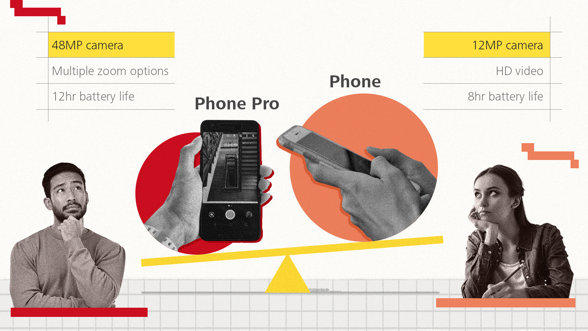
Clear hierarchy · Editorial layouts · Information-led composition
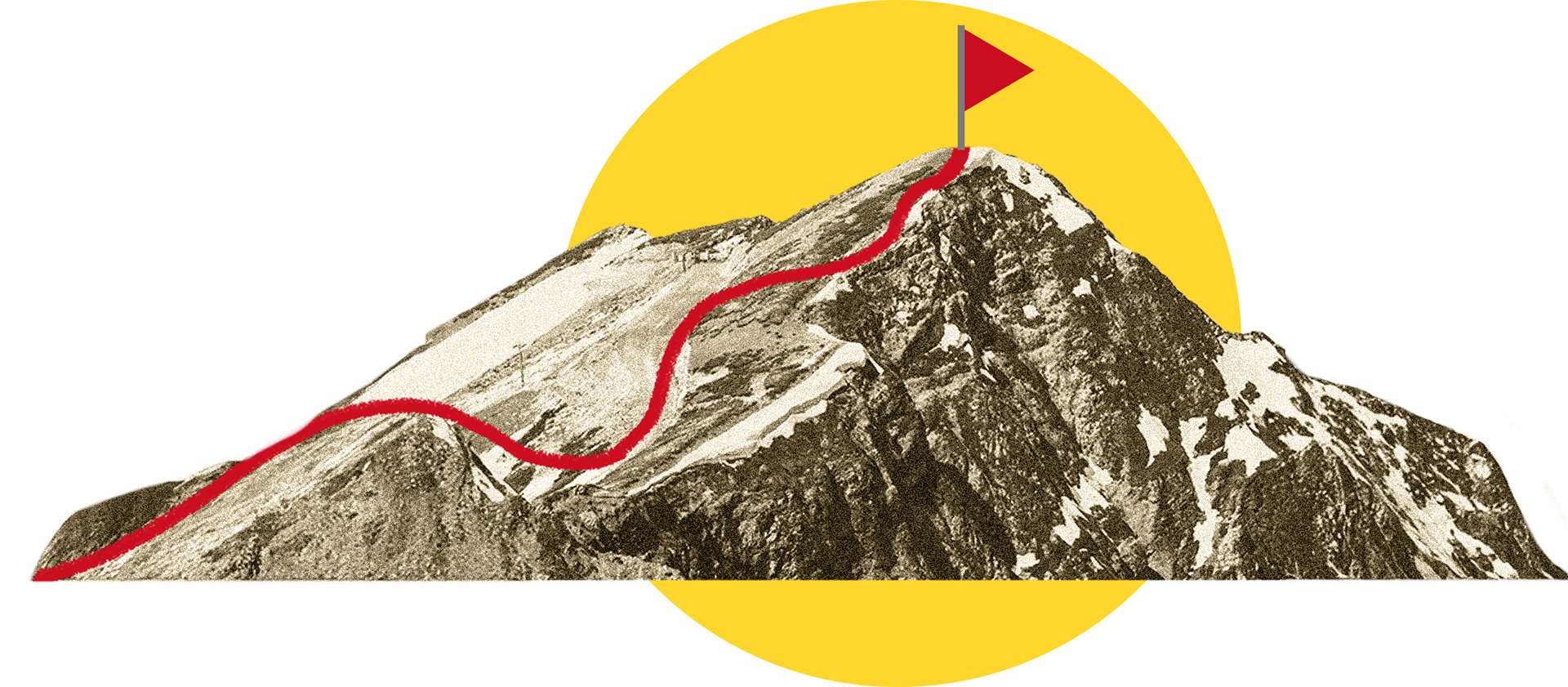
Visual metaphors
Everyday objects and collage-based metaphors made abstract ideas easier to understand and remember.
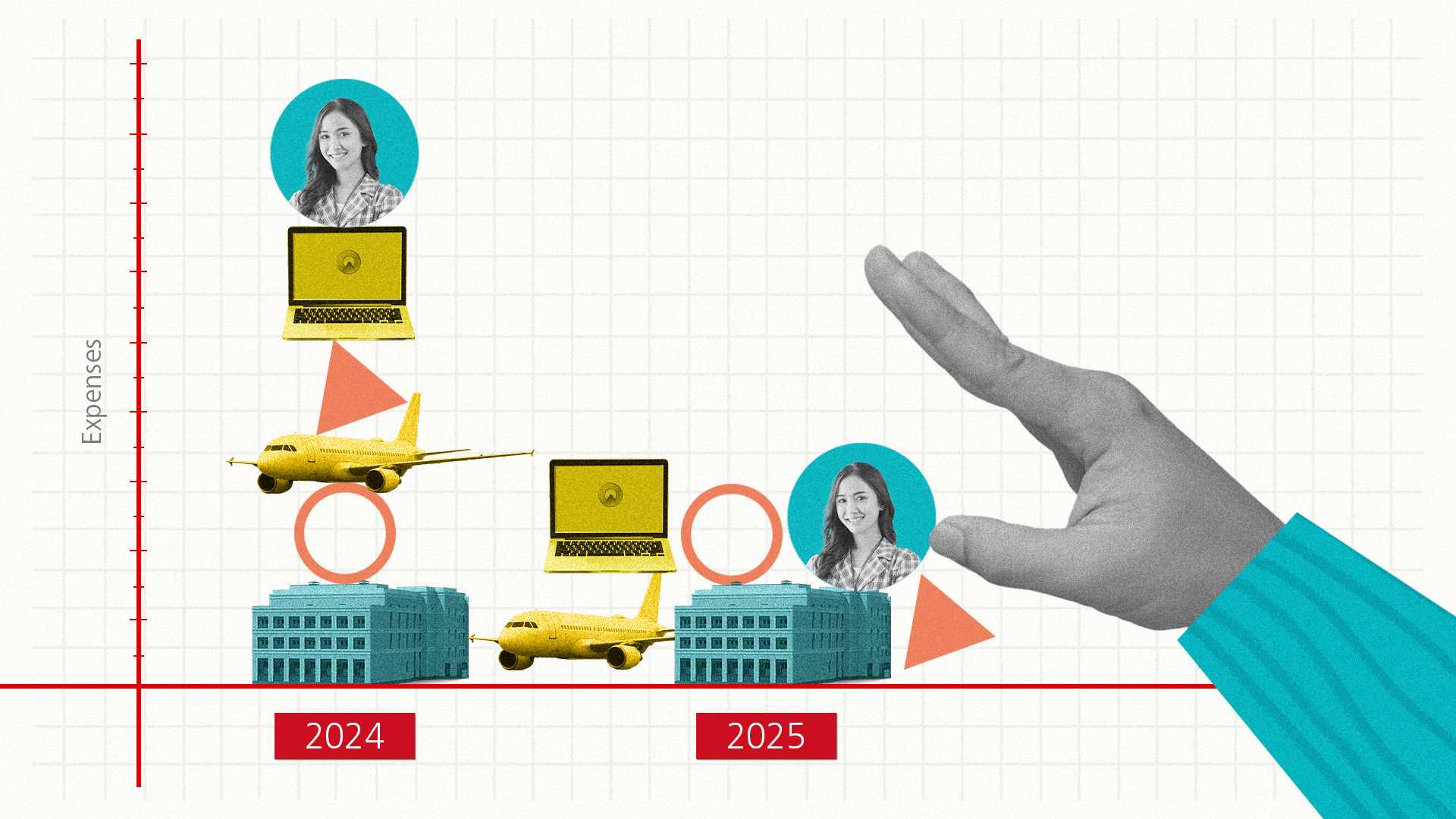
Stacking expenses:
Turning changing costs into a physical balancing act.
Turning changing costs into a physical balancing act.
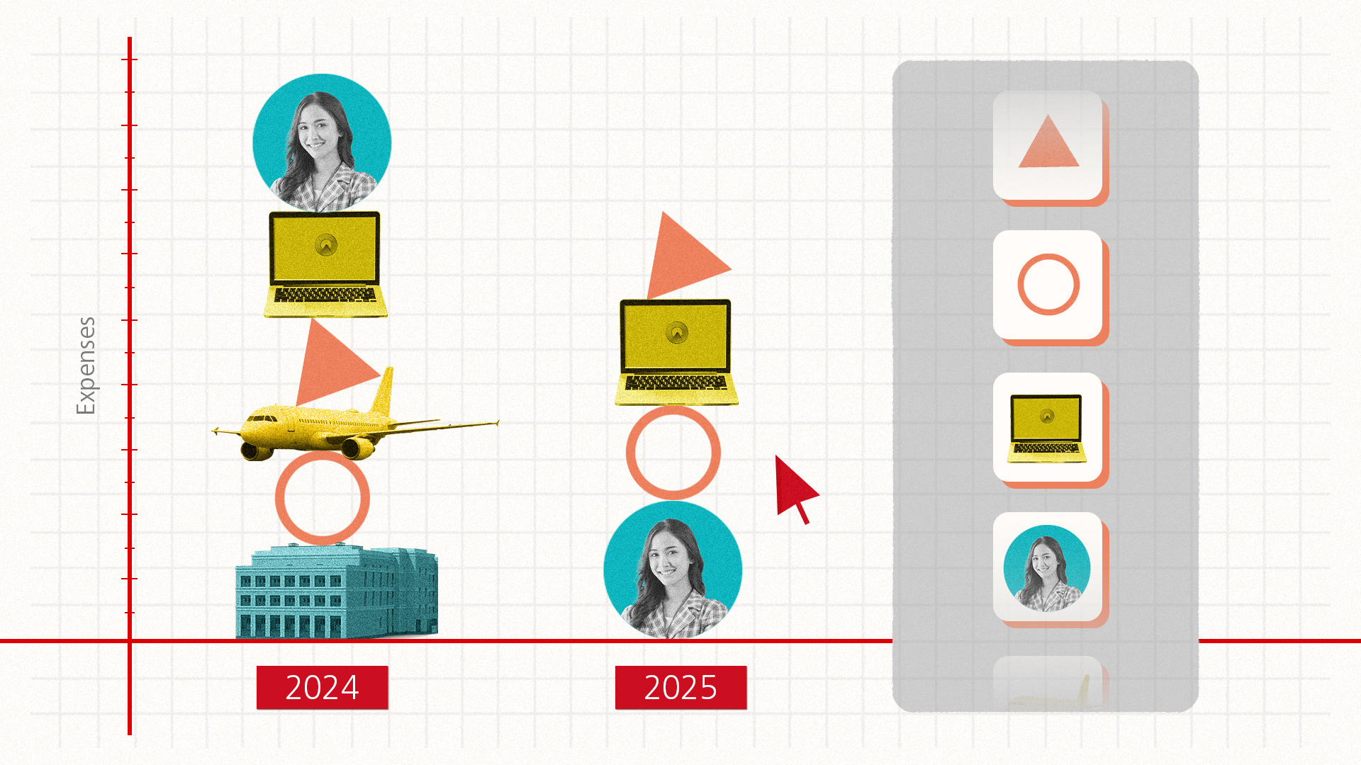
Interactive decision-making:
Showing information as something that can be rearranged and reassessed.
Showing information as something that can be rearranged and reassessed.
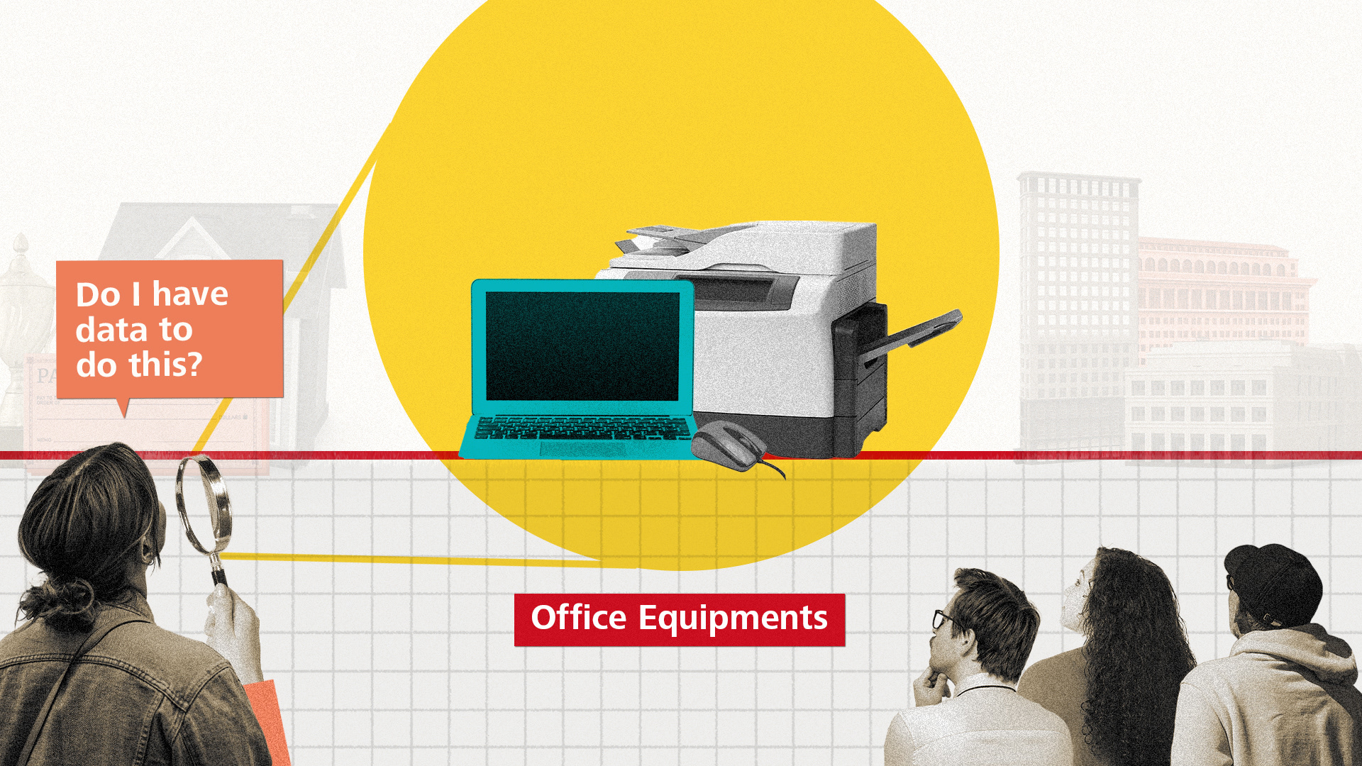
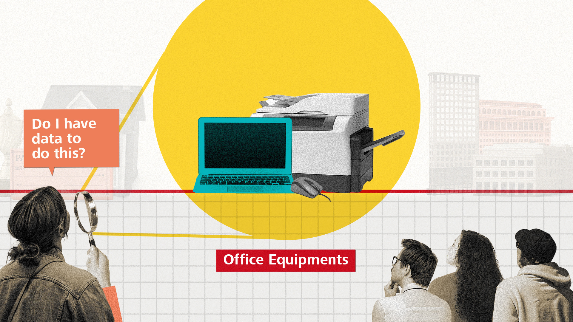
Questioning everyday expenditure:
Using familiar office objects to make the idea immediately relatable.
Using familiar office objects to make the idea immediately relatable.
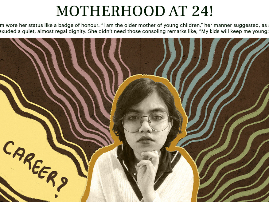
People and Participation
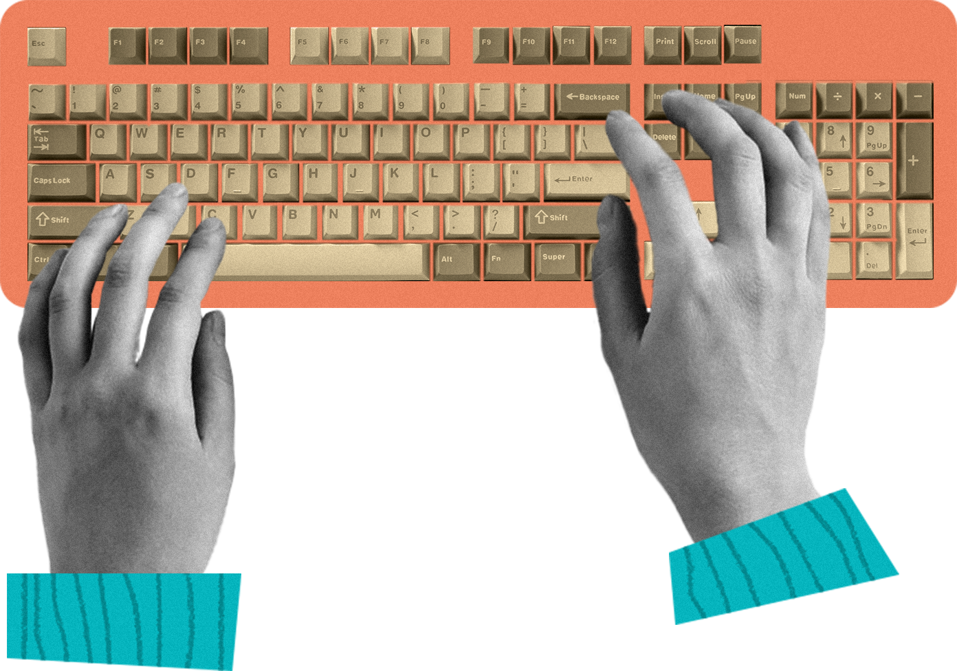
Cut-out photography brought a more human, inclusive
and globally relevant tone to the film.
and globally relevant tone to the film.
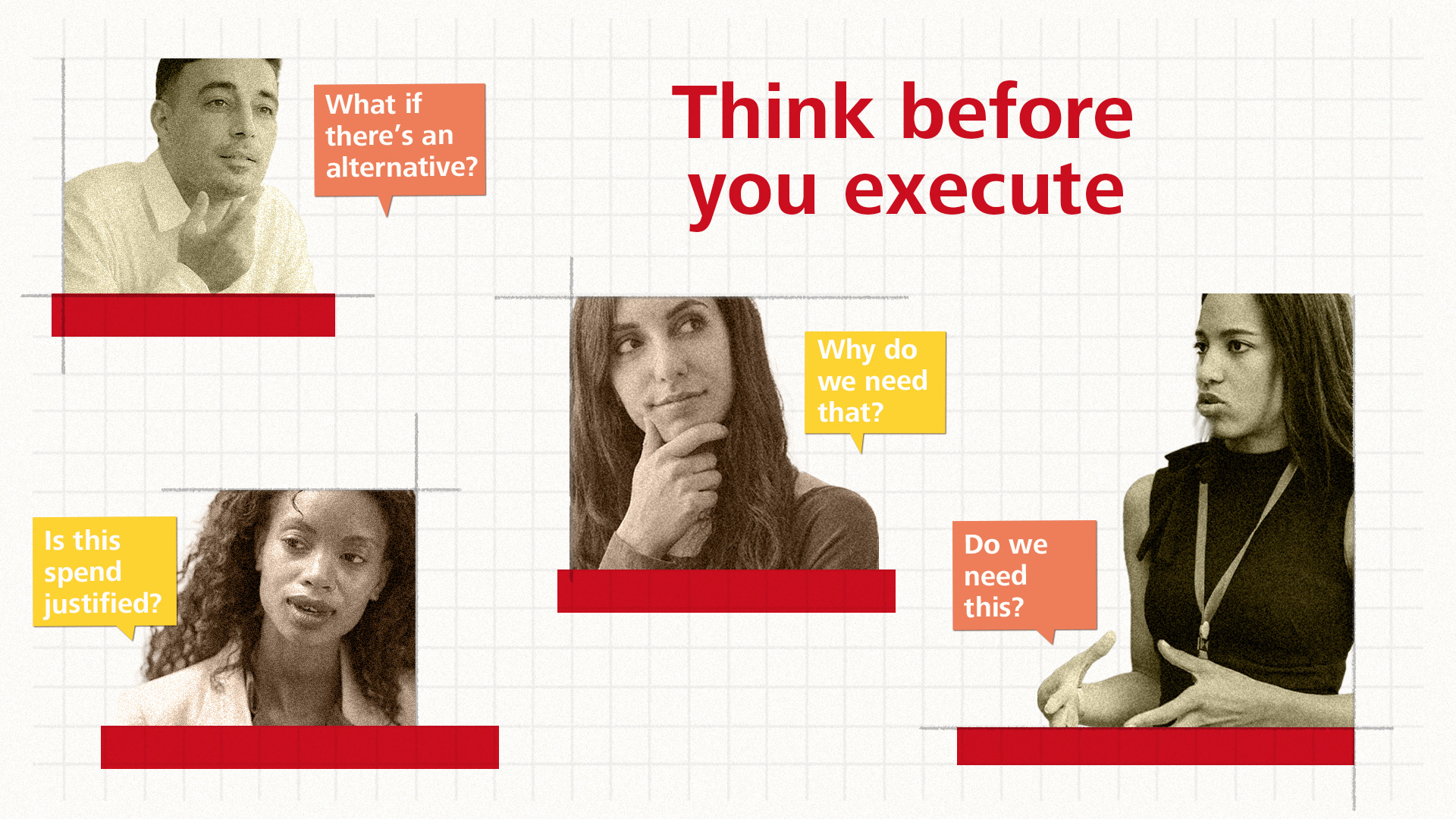
Human-centred communication · Multiple perspectives · Conversational learning
The result was a more flexible and contemporary visual language—designed to reduce monotony, sustain attention and make internal learning feel more approachable.
Credits
Client: Schindler
My contribution: Visual direction, editorial design,
styleframes and asset creation
Production Studio: Supercut Studios
Motion execution: Ananda
My contribution: Visual direction, editorial design,
styleframes and asset creation
Production Studio: Supercut Studios
Motion execution: Ananda